Check out the link below to watch my Slide Share presentation
https://www.slideshare.net/TeddySmith9/evaluation-6-what-have-you-learnt-about-technologies-from-the-process-of-constructing-this-product-75247551
Enjoy 😃
Thursday, 20 April 2017
Evaluation 5: How did you attract/address your audience?

Masthead: The masthead of my magazine is in a
large and bold text that follows the house style and colour scheme of my
magazine. The use of serif font crates the idea of sophistication and
professionalism along with the colour scheme which appeals to those of middle
to high class. However, this doesn’t in any way make my magazine seem boring or
outdated as this idea was inspired by modern day Kpop and Korean lifestyle
magazines like ‘CeCi magazine’. The use of a dropped capital ‘K’ emphasises the
idea of it being a Kpop magazine since the word Kpop means ‘Korean pop’ and
Kstar means ‘Korean Star’ so it follows the same pattern. This type of
abbreviation is familiar to Kpop fans and thus makes it easily identifiable as
a Kpop magazine. The use of the word star links to the fame that Kpop stars
have and suggests that there will be celeb gossip and news about Kpop stars
inside which would appeal to the average Kpop fan as suggested in my questionnaire.
This is further emphasised with the use of a star icon which is more pleasing
to the eye than just a plain title which may have negligible impact on the
reader.
Cover lines: These are the cover lines and features of my
magazine. These have been made to attract a potential reader as the feature
what the magazine will contain. Each cover line is distinctly different to add
variety however all follow a strict Red, Black, White and Blue colour scheme. This
emphasises the house style whilst making it aesthetically pleasing to the eye. On
the bottom cover line reading ‘Seoul Style’. I changed it to this ‘chalkboard’
font to represent the street art movement in South Korea which would interest
the ‘modern rebellious Korean teen’ However, it also represents how ‘fragile’
the genre is and how it can always be changed just like chalk or paint which I
think is very interesting and would be appreciated by the target audience. This
also adds variety to the other cover lines and is something interesting for the
reader to look at opposed to just plain serif text. Each cover line is larger
than the text below it in order to grab the reader’s attention before they read
further as if it was all the same size it would fade into the background.
Language: Throughout the entirety of my magazine I have used many different
types of language to appeal to my target audience. For instance, I have
incorporated the Korean Writing system of Hangul into my magazine cover which
appeals to the target audience since it not only is the first language of most
Kpop fans but it is also appeals to those that have an interest in Korean culture
as well. Furthermore, this is a defining trait of most Kpop magazines as their
readers tend to be Korean. The large Korean writing along the bottom is
significant as it means ‘Hello’ and is almost introducing the magazines first
issue and links to the rise of a new Korean star (My main artist – UNIQUE). Also,
I have used a text abbreviation in the form of ‘WTF’ which creates the idea
that my magazine is quite edgy as the actual meaning of ‘WTF could not be
published on the front of a magazine. The alliteration of Seoul Style is a persuasive
literacy technique that I have used in order to grab the potential reader’s
attention.
Photography: The picture I used on the front of my magazine was edited using Photoshop to create the ‘Perfect Korean’ image. The picture covers a large section of the page and is half covered, making the reader want to open the magazine to find out who this person is. The fact she is posed covering her face furthers the idea of mystery and thus intrigues a potential reader. The artist is looking straight into the readers eyes, addressing the audience. This is a main convention of any magazine.
Mise en scène: On the front cover, I have used many
different colours in the background which is meant to represent a trendy street
in Gangnam, South Korea. I was able to merge two images with the use of
Photoshop to create an illusion of a blurred, busy district. This links to the mysterious
artist ‘UNIQUE’ and foreshadows what is to be expected further on in the
magazine. This also adds an element of mystery to the reader and may entice
them to read further.
Competition: I added a competition as this is a common magazine feature and may entice a person to buy the magazine as they want to be in with a chance of winning the prize up for grabs. This competition is relevant to Kpop fans as it would allow them to download music from their favourite artists.
Selling Price: The selling price of my magazine is only £3.50 (as suggested by my questionnaire) which is within the pocket money range of most people aged 16-25. This makes it much more reasonable to purchase than if it were £5.00 like other music magazines.
 |
Layout: The layout of my text is need and all inline with each other. The only exception to this is the text surrounding the polaroid picture as this would seem more interesting than the text. I have used a number of separations also to break up the text to make it easier on the readers eyes. I believe that the reader would appreciate this order as it will be much easier for them to locate the page that they wish to look at.
Font: The font that I have used throughout my magazine tends to be the same serif font, however in the contents I have decided to use a hand written style font a number of times in both Korean Hangul and in English on the polaroid 'undiscovered discovery. This handwritten style text helps to emphasise the young audience (16-25) that I want to appeal to as this creates a kind of scrap book style that features predominantly in teen/ young adult magazines.
Colour scheme: The colour scheme of my magazine overall is very diverse, here in the
contents page however I have decided to use a more monochrome colour scheme with a Smokey grey background. This was because I wanted the contents page to be relatively plain and not over crowded as this is a place that you go to find the things that you want to read about so it should be simple on the eye and not too 'out there'. I think that the slightly bland colour scheme worked and it is very similar to that of another magazines contents page that I analysed called 'NYLON' in which it worked really well. The overall look, I think, looks very professional.
contents page however I have decided to use a more monochrome colour scheme with a Smokey grey background. This was because I wanted the contents page to be relatively plain and not over crowded as this is a place that you go to find the things that you want to read about so it should be simple on the eye and not too 'out there'. I think that the slightly bland colour scheme worked and it is very similar to that of another magazines contents page that I analysed called 'NYLON' in which it worked really well. The overall look, I think, looks very professional.
Photography: The photography which I used for the contents page could be considered to be quite abstract and crates an effect of confusion to the reader which is the effect that I wanted it to have, in the photo you can see only the artists eye and her hands covering the rest, which builds upon the picture on the front cover in which she is covering her moth with her hands. The position in which she stands builds upon the mystery of the 'Kpop's newest star' (as put on the front cover). I also put this photo in a polaroid frame which creates a sense that it is almost amateur, which links to the scrapbook style I was aiming to achieve with this page. Furthermore, I made sure this was the only picture on the page to make sure that it would be the centre of attention to the reader. Overall, I believe that this appeals to the target audience since Kpop is a very abstract and some may say weird genre of music and I believe that the photography I used on this page portrays this.

Social Media: The incorporation of social media is very significant for the reason that the audience which I wish to appeal to ,which are people aged 16-25, would probably consider themselves to be avid social media users. If my magazine is able to involve readers through the medium of social media then that is very powerful as it means that my magazine instantly increases the amount of potential readers. Many magazines nowadays have multiple social media accounts which are able to involve readers in features and stories in their latest editions so for my magazine not to have some sort of reference to social media would be insane.
Colour scheme: Here I have used the colour very differently in comparison with the rest of my magazine. The use of pinks are very important when conveying meaning to my readers, I want the use of colour to be justified and mean something and I think that come through very well in this page. I have used a range of pinks in order to express femininity, and although my magazine is unisex, stereotypically Kpop fans tend to be mainly female so I believe that this use of pink would appeal to the majority. different shades of pink allowed me to create a shadowed effect of Q&A in the background which establish what the page is about. hot pinks contrast the background making it easier to read the title. The use of very light pink has been used to represent the sweetness and innocence of the singer who is yet to push herself into the public eye and open up fully unlike the hot pink flowers which surround her that have connotations of confidence and passion and playfulness, just like the majority of other Kpop singers she is surrounded by. This appeals to the audience as they would want to follow her journey to the top to watch her blossom into a star.
Photography: The photography I have used here is interesting in that it only reveals half of the artists face and she is also fading into the light pink background creating the idea that she could easily fade away like most Kpop stars. This may interest a reader as they would hope the best for her as a singer after reading her interview. Furthermore, the photograph in which she is smiling gives us the impression she is childlike and pure, untainted by the music industry. With the added effect of the flowers it brings out real natural beauty which is uncommon in the Kpop industry and goes against the codes and conventions of most magazines in that they are heavily edited and this is the opposite. A reader would appreciate this uniqueness and possibly want to look into her further as she challenges what is accepted to be 'the perfect Korean image'.
Content: The actual content of my magazine follows the main codes and conventions of any music magazine in that it focuses mainly on the artist and her music and not much else. However, she talks about her own life experiences and what lead her to produce some of her music. These life experiences may lead to the readers being able to relate to her as a real human being and not so much as an artist which is important as readers feel connected and everything becomes a lot more realistic, which Kpop often strays away from, thus giving my magazine a distinct unique selling point.
Layout: The layout is very simple and nothing too special, it is all laid out neatly in columns which is standard for any magazine. This addresses my audience since people would want to read something that was neat and easy on the eye.
Tuesday, 18 April 2017
Evaluation 4: Who would be the audience for your media product?
The target audience for my magazine would be in the young adult category (16-25), which could be seen as quite a large age range for a genre specific magazine, however, I believe and my questionnaire results suggest that this is the age group which have the largest interest in my magazine. Age aside, I believe that my audience will be formed of people who have a taste in Kpop or who have a large interest in the culture of Korea. 'Kstar' magazine will also appeal to those which may have grown up in the boom of Kpop in the 90's and 00's when Kpop music first started to be produced. This being said, I also think it appeals to the younger generation of fans who first herd of Kpop due to the success of PSY will also have an interest in my magazine. This has been reflected in the 'pocket money' price that I gave to my magazine and the use of informal language within my magazine. when it come to demographics, I strongly believe that my magazine will appeal to both western and eastern tastes. I think that the majority of my audience will be of asian origin and there would also be a large western following too from the USA, UK and Europe. The magazine may be more prominent in Korea if fully translated into Korean however the english version whilst still appealing to the Korean market, is likely to have more of an impact on the western world, especially in the UK which makes up nearly half of Europe's Kpop fanbase!
Furthermore, my magazine is a unisex magazine which aims at appealing to both men and women. i think that i achieved this due to the fact I made the colour scheme very plain and simple. On the other hand, Kstar may appeal to women more than men for the reason that in my double page spread I have used a large amount of pinks and pictures of flowers to emphasise my main artist's (UNIQUE) femininity which may be empowering for a female audience opposed to a male audience. However, this is such a small section of my magazine and for that reason I feel that my double page spread would not make a difference to the fact that my magazine is unisex as a lot of Kpop fans would look past this due to the fact that men are often 'feminised' in Kpop anyways.
 |
| Statistics are from Yonhap News and The Korea Times |
 |
| Popular Kpop band 2NE1 wearing 'feminine colours' |
 |
| Korean boyband EXO all wearing pink |
I believe that my audience should be unique and individual and I think to appreciate all aspects of Kpop you have to be somewhat different to the 'norm'. People who read my magazine will be young, open minded people who have a taste in modern music, fashion and art (etc) and like things that are out of the ordinary. For western fans, my magazine will be somewhat of a safe place for them to express their own individual tastes and guilty pleasures that they may suppress in order to fit in with western society. The younger, more rebellious generation of young adults in Korea may be pulled to my magazine as it discusses things they are interested in and goes against traditional Korean culture and modesty without being explicit.
 |
| Modern (Rebellious) Korean Teenagers |
 |
| Modern Korean Fashion |
Evaluation 3:What kind of media institution might distribute your media product and why?
Click the link below to check out my Evaluation 3:
Enjoy 😊
Saturday, 15 April 2017
Evaluation 2: How does your media product represent particular social groups?
I think that my magazine clearly represents similar social
groups as to that of CeCi Korea, NYLON, and other prominent Kpop and Korean
Lifestyle magazines that exist in South Korea. From the colour choices of my
magazine right down to the intricate details like font and the incorporation of
Korean text really compliment the tastes of my audience and thus particular
social groups.
One of the main social groups I believe my magazine would
appeal to would be the younger generation of Eastern and South-Eastern Asia.
This is due to the sudden boom in popularity of Kpop in countries other than
South Korea such as Japan, China and Thailand where the genre has become a huge
hit. Some people feel that the genre empowers them as Asian people in that they
do not have to look up to western people for entertainment since there are now
stars who are even more popular than western stars. This spread of the Kpop
culture had created an entire sub-culture of people in Asian countries who are
deeply interested in the Kpop style which incorporates both traditional Asian
culture and also western culture. This fusion of styles fits perfectly in
modern day Asia and is especially clear to see in Urban areas of Seoul such as
Gangnam and also in Japanese cities like Tokyo and Osaka all which are
perceived to be very trendy.
 |
| Incorporation of Gangnam into my design (background) |
 |
Street in Gangnam (Seoul, South Korea)
The colours of my magazine are bright and refreshing to look
at which is a stark contrast to colours traditionally used in Asian culture
which typically tend to be darker, more regal colours such as gold, Yellow and
Red. This is because I wanted to emphasise the change and difference of
modern and traditional Asian design which Kpop encompasses. However, saying
this I adapted red into my design in order to give the magazine a more
professional and classier feel to the audience like CeCi magazine. Red, Blue
and white are equally important as thy are used to represent the colours of the
South Korean flag. I think this helps to give the magazine an identity of its
own which is very appealing to the audience as they will be able to easily
recognise it as a Korean ‘themed’ magazine. This appeals to the audience as
they tend to favour the pop culture of Asian countries like Korea over that of
western pop culture so to be able to identify it clearly as something that is
clearly Korean is important.
Furthermore, although my magazine is a unisex
magazine I feel that the pink is important as the vast majority of Kpop fans
are females. Pink is significant as not only is it eye-popping or the audience
but it is also a very stereotypically ‘girly’ colour which complements the
femininity that I tried to portray through my double page spread. This also
adds to the idea of my artist being innocent and pure, untouched by the media
in the sense she remains secretive. The different shades of pink were used to
give meaning and create depth through a 3D effect with the ‘Q&A’ in the
background along with bright pink flowers that create the illusion that the
page goes on beyond the text and is almost three dimensional. This was used to
show that my artist is more than what you might see at first glance and there
is so much more for the audience to learn about her. The subtle colours also
help to create this idea of being secretive as the ‘Q&A’ almost sinks into
the background and it also shows that UNIQUE doesn’t want to give too much
away. This appeals to the specific social group because more often than not
Kpop challenges the music industry with its uniqueness and I believe that my
magazine caters to this uniqueness as it goes against most of the typical codes
and conventions of a western pop magazine and brings something different to the
table.

Additionally, I believe I have succeeded in appealing to
said social group through the styling of my magazine. For instance, on the
front cover of my magazine there is a feature that reads ‘Seoul Style’. Not only
is this an example of the incorporation of alliteration which is said to persuade
an audience but it also represents a certain aspect of the Kpop sub culture
through its use of font. The slightly chalkboard style of the font is used to
represent the street art which is prominent in Seoul, south Korea. This Street
art is a huge representation of how Korea is developing into an extremely
modern and trendy society as in past years’ graffiti and expressing one’s self
through art was seen as taboo. Furthermore, it represents the rebelliousness of
the younger generation of young Koreans bought up in the era of Kpop. However,
it could also be interpreted that the use of this font highlights the fragility
of the Kpop genre, in that it can easily be erased and changed just like chalk,
thus representing the ever-changing tastes of Kpop fans.
 (incorporation of Graffiti/ street art in my design) 
(Korean street art)
|
Tuesday, 11 April 2017
Evaluation 1: In what ways does your media product use, develop or challenge forms and conventions of real media products?
Check out my Prezi presentation using the link below -
http://prezi.com/w5pvgztinvwe/?utm_campaign=share&utm_medium=copy
Enjoy ☺
http://prezi.com/w5pvgztinvwe/?utm_campaign=share&utm_medium=copy
Enjoy ☺
Friday, 10 March 2017
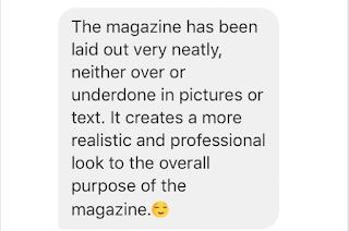
Feedback on magazine via social media
After completing my magazine I went around and asked some family and friends to feedback on what I had created. I thought that this information would be imperative to getting my magazine to be as creative and well suited to the targeted audience as possible. This is what they said...

Audrie, F, 16 (Facebook Messenger)


Toby, M, 16 (Facebook Messenger)

Linda, F, 70 (Whatsapp Messenger)

Caitlin, F, 17 (Apple iMessage)
Subscribe to:
Comments (Atom)