I think that my magazine clearly represents similar social
groups as to that of CeCi Korea, NYLON, and other prominent Kpop and Korean
Lifestyle magazines that exist in South Korea. From the colour choices of my
magazine right down to the intricate details like font and the incorporation of
Korean text really compliment the tastes of my audience and thus particular
social groups.
One of the main social groups I believe my magazine would
appeal to would be the younger generation of Eastern and South-Eastern Asia.
This is due to the sudden boom in popularity of Kpop in countries other than
South Korea such as Japan, China and Thailand where the genre has become a huge
hit. Some people feel that the genre empowers them as Asian people in that they
do not have to look up to western people for entertainment since there are now
stars who are even more popular than western stars. This spread of the Kpop
culture had created an entire sub-culture of people in Asian countries who are
deeply interested in the Kpop style which incorporates both traditional Asian
culture and also western culture. This fusion of styles fits perfectly in
modern day Asia and is especially clear to see in Urban areas of Seoul such as
Gangnam and also in Japanese cities like Tokyo and Osaka all which are
perceived to be very trendy.
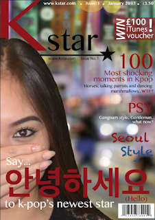 |
| Incorporation of Gangnam into my design (background) |
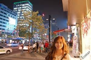 |
Street in Gangnam (Seoul, South Korea)
The colours of my magazine are bright and refreshing to look
at which is a stark contrast to colours traditionally used in Asian culture
which typically tend to be darker, more regal colours such as gold, Yellow and
Red. This is because I wanted to emphasise the change and difference of
modern and traditional Asian design which Kpop encompasses. However, saying
this I adapted red into my design in order to give the magazine a more
professional and classier feel to the audience like CeCi magazine. Red, Blue
and white are equally important as thy are used to represent the colours of the
South Korean flag. I think this helps to give the magazine an identity of its
own which is very appealing to the audience as they will be able to easily
recognise it as a Korean ‘themed’ magazine. This appeals to the audience as
they tend to favour the pop culture of Asian countries like Korea over that of
western pop culture so to be able to identify it clearly as something that is
clearly Korean is important.
Furthermore, although my magazine is a unisex
magazine I feel that the pink is important as the vast majority of Kpop fans
are females. Pink is significant as not only is it eye-popping or the audience
but it is also a very stereotypically ‘girly’ colour which complements the
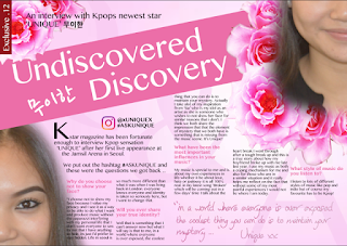
femininity that I tried to portray through my double page spread. This also
adds to the idea of my artist being innocent and pure, untouched by the media
in the sense she remains secretive. The different shades of pink were used to
give meaning and create depth through a 3D effect with the ‘Q&A’ in the
background along with bright pink flowers that create the illusion that the
page goes on beyond the text and is almost three dimensional. This was used to
show that my artist is more than what you might see at first glance and there
is so much more for the audience to learn about her. The subtle colours also
help to create this idea of being secretive as the ‘Q&A’ almost sinks into
the background and it also shows that UNIQUE doesn’t want to give too much
away. This appeals to the specific social group because more often than not
Kpop challenges the music industry with its uniqueness and I believe that my
magazine caters to this uniqueness as it goes against most of the typical codes
and conventions of a western pop magazine and brings something different to the
table.
Additionally, I believe I have succeeded in appealing to
said social group through the styling of my magazine. For instance, on the
front cover of my magazine there is a feature that reads ‘Seoul Style’. Not only
is this an example of the incorporation of alliteration which is said to persuade
an audience but it also represents a certain aspect of the Kpop sub culture
through its use of font. The slightly chalkboard style of the font is used to
represent the street art which is prominent in Seoul, south Korea. This Street
art is a huge representation of how Korea is developing into an extremely
modern and trendy society as in past years’ graffiti and expressing one’s self
through art was seen as taboo. Furthermore, it represents the rebelliousness of
the younger generation of young Koreans bought up in the era of Kpop. However,
it could also be interpreted that the use of this font highlights the fragility
of the Kpop genre, in that it can easily be erased and changed just like chalk,
thus representing the ever-changing tastes of Kpop fans.
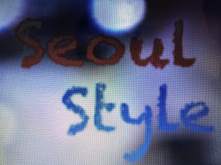
(incorporation of Graffiti/ street art in my design)

(Korean street art)
|


No comments:
Post a Comment